Markerry
Summary
Markerry is a SaaS tool that helps media buyers create and manage splits with personalized landing pages and traffic distribution rules. Also, within this tool, users can track statistics for these splits.
Year
2020-2022
Role
UX/UI Designer
Scope
Branding; market research; qualitative research; ideas delivering; prototyping; creating artifacts.
Branding
We wanted Markerry to be associated with wealth and success, so I picked green as the main color and dark blue as the secondary one. When creating a logo, I tried using an arrow pointing up to signify growth and accomplishment. Eventually, we ended up choosing a simpler version that yet conveyed confidence and reliability.
Our goal was not only to ensure convenient functionality but also to maintain a neat and consistent visual appearance given the amount of ti.
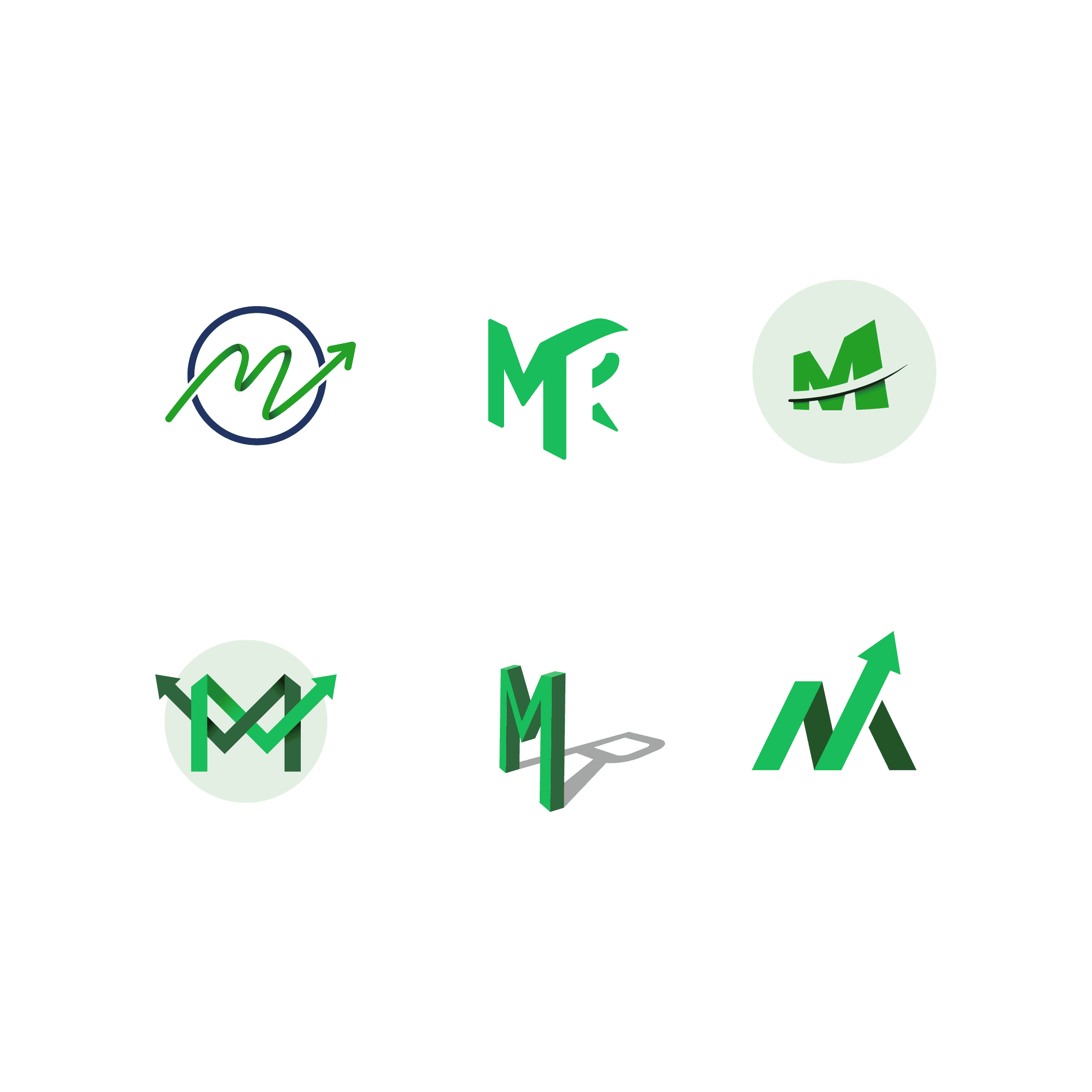
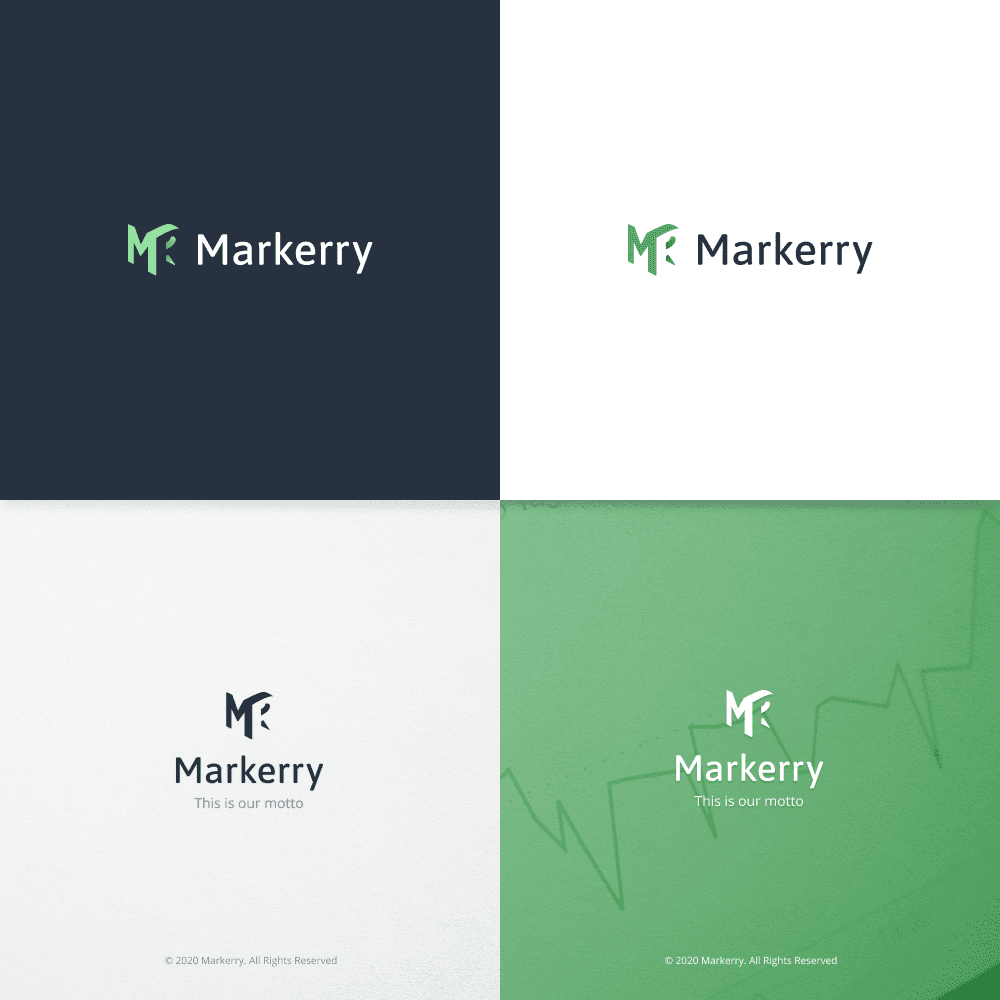
Logo samples vs final logo design
Redesign
Scope
Creating the new design for Markerry, it was essential to maintain a sleek and minimalistic approach, given the amount of time users spent there managing their splits and campaigns. Also, we pursued new opportunities to refine Markerry's feature set, intending to boost its efficiency.
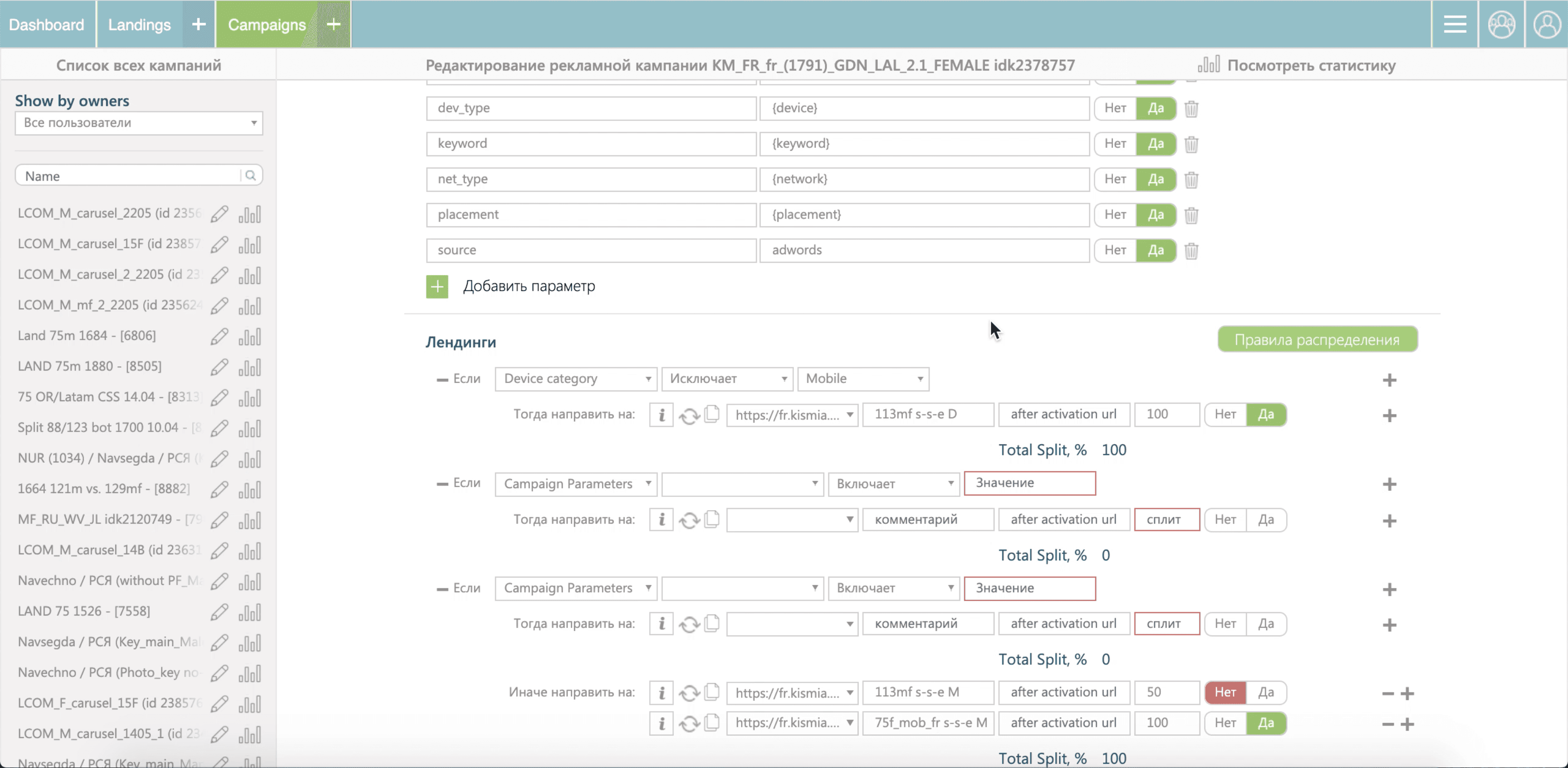
Split creation before
Split creation after
Design process
Empathize: Insights from experts (Lead Media Buyer, CMO) guided our understanding of project objectives. User interviews unveiled user tasks and challenges.
Define: Team brainstorming led to idea generation, evaluation, and prioritization.
Prototype: Iteratively evolving from low to high-fidelity prototypes ensured efficiency.
Test: Usability testing validated user goal achievement with the new interface.
Deliver: Our development team translated designs into functional solutions.

The process of brainstorming
Dashboard
Defining the problem
In our research, we primarily concentrated on users' objectives rather than the measures they implemented to attain them.
Creating a picture of metrics hierarchy and their effect on reality helped to gain an understanding of the issues to be solved. Later, they were stated as a How-Might-We questions.
HMW-questions that stated the problem with solutions suggested
Looking for solutions
The primary research on stats monitoring revealed that the analyzed data is often complex and multi-layered. Therefore, it was crucial to maintain the ability to navigate through these layers without losing any progress along the way.
User Journey Map: stats monitoring
In the initial concept, the idea of supporting multiple dashboards for various data layers was proposed.
For instance, high-level metrics such as ROI would be placed in one tab, while lower-level metrics critical for sustaining ad campaign performance (CR, ePC, ARPU) would reside in another.
Through usability testing sessions, we discovered that this concept wouldn't be viable.
This was because all the metrics were tightly interconnected, and a more accurate approach would be to enable users to explore the data step by step, progressively.
The initial concept (low-fidelity)
We went through several iterations to finalize this concept, and then we delivered it to the users.
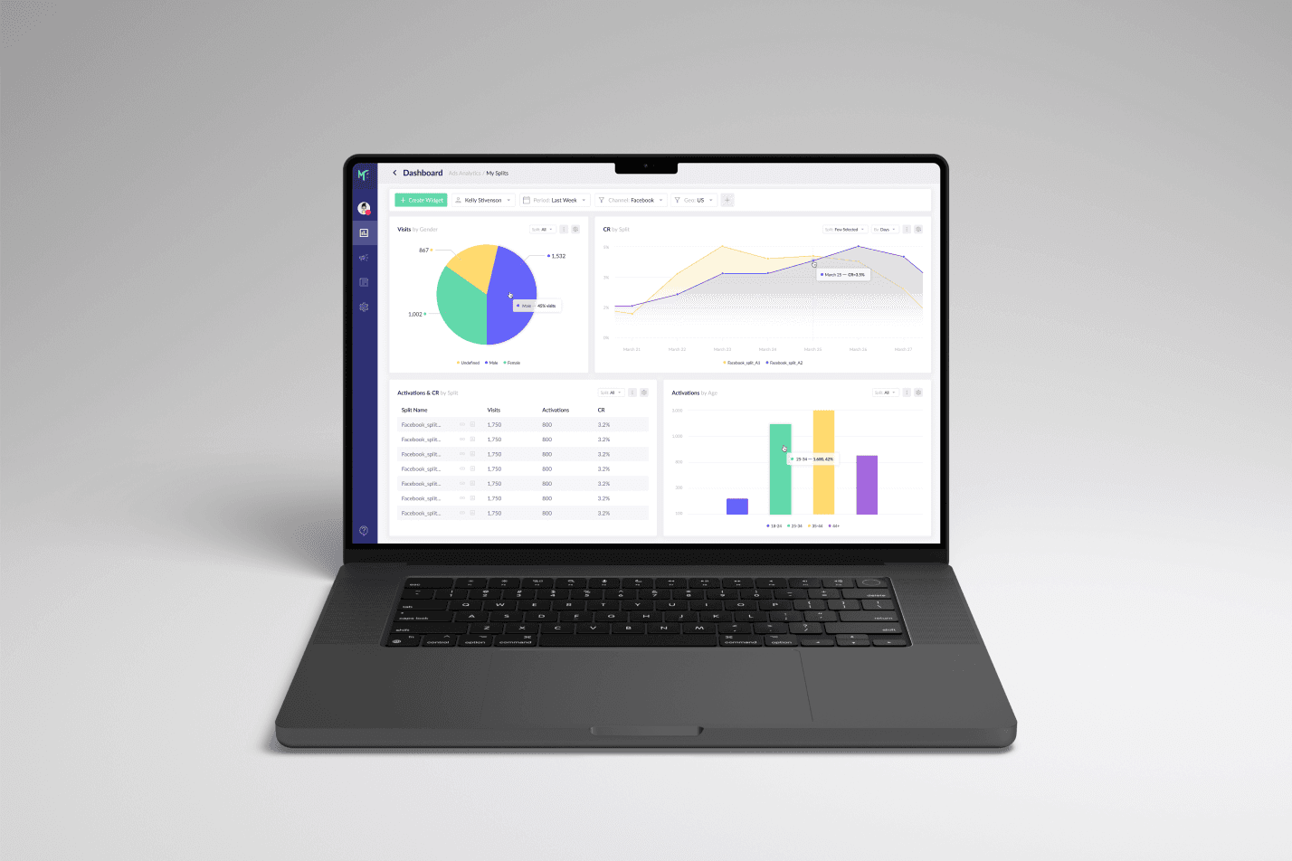
In the final version, we introduced a concept that allows users to transition from high-level metrics to lower-level ones within one widget, while maintaining their relationship.
The final dashboard design
Results
Introducing our new vision for Markerry had a substantial impact on the productivity of the entire marketing team.
Media buyers could complete their tasks roughly twice as fast, and the process of onboarding new specialists became quicker and easier.
Also, the updated design reduced the number of mistakes made when monitoring campaign statistics and making decisions, resulting in cost savings.